
The change is part of a broader branding update by the Danish container carrier, connecting its land, sea, and air freight services under one unified identity.
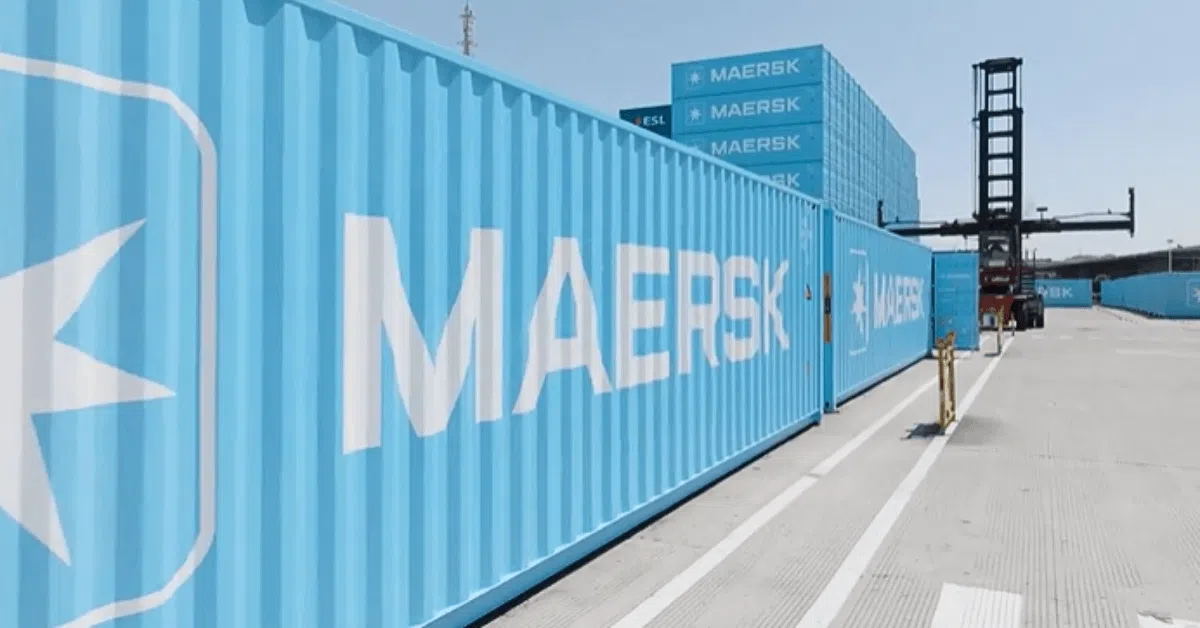
The freshly painted blue containers have already started making appearances, with 85,000 new units ordered from China.
These are only the beginning, as the company plans to roll out even more in the coming years. Meanwhile, the white colour scheme for Maersk’s refrigerated (reefer) containers will remain unchanged.
The container makeover follows earlier changes that Maersk introduced to its vessels.
Since 2023, the company’s newbuild ships now display white hull markings instead of the former black, and the signature seven-pointed Maersk star is now featured more prominently on the hulls.
The company announced the makeover on its social media handles, calling it “the big reveal” and explaining that the blue colour represents more than just design. It reflects Maersk’s long-standing legacy and reliability across its global supply chain services.
The shift connects the containers visually with Maersk’s vessels, trucks, planes, cranes, vans, and logistics facilities that already wear the same signature blue.
Maersk first introduced containerised shipping in 1975 with the launch of its Panama Line. Since then, the grey dry container has become a recognisable part of the global logistics landscape, symbolising Maersk’s dependability.
Now, nearly five decades later, the company says it’s time for these containers to match the blue that reflects its brand identity, built over more than 120 years.
A Maersk spokesperson shared that the containers are not only practical but also serve as the most visible representation of the brand.
The shift to blue, according to the company, celebrates the trust that customers place in Maersk to move their cargo around the world.